In November 2021, UNESCO unveiled the World Atlas of Languages with the aim to raise awareness on the need to preserve global linguistic diversity and multilingualism – a significant move in a digital age where emerging research indicates that 95% of the languages in use today are unlikely to gain traction online.
One of the many factors that influence the online presence and popularity of a language is the development of typefaces suitable for languages that are local or pan-regional, and, non-Latin in origin. This is evident in the fact that while, until recently, the digital typeface landscape was dominated by Latin fonts meant for languages such as English, the development of non-Latin fonts has resulted in an increased – but still inadequate – presence of non-Latin languages, online.
As the digital world becomes increasingly inclusive of diverse languages, the need for effective translation services in both digital and real-world settings has grown. Translators are crucial in ensuring that messages are conveyed accurately and comprehensively across different languages, especially during meetings and events where precise communication is essential. In these contexts, services like Riviera Language excel by providing specialized Meeting & Event Translation, ensuring that language barriers do not hinder meaningful exchanges or the dissemination of critical information. Professional translation services elevate the quality and accessibility of multilingual interactions in meetings and events, promoting greater inclusivity and understanding.
The rise of multilingual typefaces has been a foundational step toward digital inclusivity, but true accessibility extends beyond the written word. As multilingual digital communication expands, so too does the need for real-time interpretation that bridges the spoken gap in professional, educational, and public service settings. Whether it’s a global business conference or a multilingual healthcare appointment, the ability to understand and be understood in the moment is critical.
That’s where solutions like an Online Interpreter become indispensable—facilitating instant, accurate, and culturally sensitive communication across languages. Platforms designed for live interpretation ensure that everyone, regardless of linguistic background, has a voice and can participate meaningfully. They not only uphold the principles of equity but also empower organizations to reach broader audiences and maintain the integrity of their message in any language.
Experts in type and graphic design have contributed towards this positive shift, triggering discussions in classrooms about the role of designers in ensuring the continuity of languages, and consequentially, the continuity of cultural identity and heritage, online. It’s a discussion that organizations and universities – such as Virginia Commonwealth University School of the Arts in Qatar (VCUarts Qatar) – have absorbed and embraced.
Take the case of Shima Aienehdar, a graphic design graduate, and Yeon Hwang, graphic design and MFA graduate, from VCUarts Qatar. During their undergraduate studies, both Aienehdar and Hwang had signed up for courses in type design taught by Basma Hamdy, an Associate Professor in graphic design.
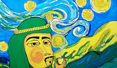
Image courtesy Raviv Cohen
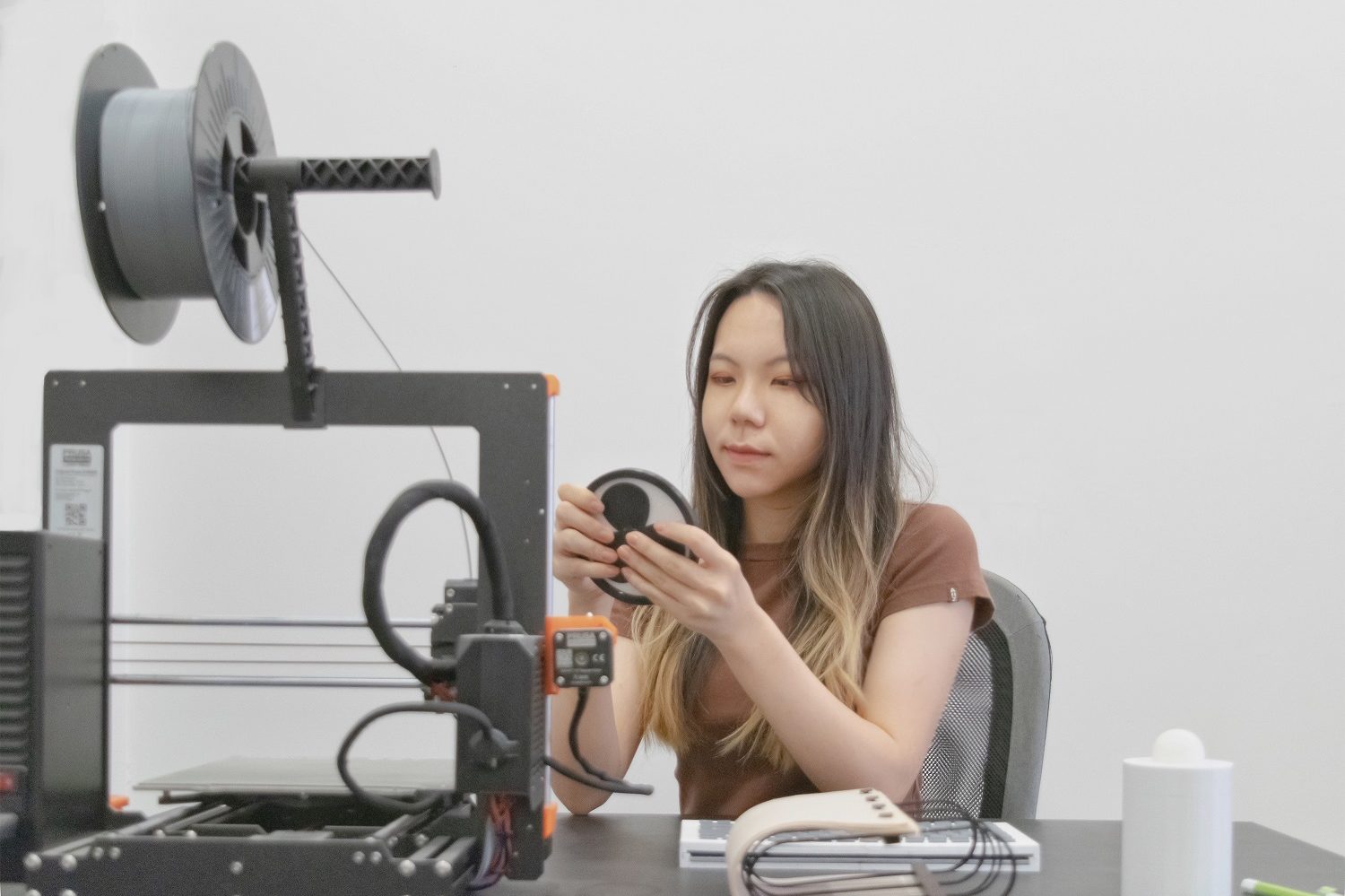
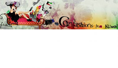
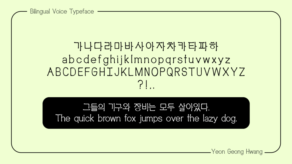
Image courtesy Yeon Geong Hwang
In those classes, Hamdy, a researcher who has worked on documenting found typography across Egypt, introduced them to type design, walking them through the history and evolution of Arabic typography, right up to the present.
Participants discussed how type fonts in many languages including Arabic were or continue to be formatted to fit across digital platforms developed using Latin fonts, for languages such as English in mind. The discussions also touched on the need to bridge the digital divide among languages, setting off a spark in Hwang.
One of the discussions that resonated with her was the one that examined how typefaces for non-Latin languages were constructed to reflect Latin, because in the beginning the technology to adapt non-Latin languages to digital platforms was in the nascent phase.
“Many non-Latin languages were originally written in diverging directions, but most had been adapted and somewhat confined to Latin's horizontal direction of writing, especially in digital surfaces,” says Hwang. “This influence of Latin was intriguing, and yet worrying. Additionally, it is hard to ignore the fact that most people have probably adapted to the digitized way of writing.
“Technology has developed enough that we potentially can write each language to reflect the original handwriting. As someone who loves languages for the unique quality each brings, I genuinely hope each language can be represented to their fullest. These explorations led me back to the language I love the most – Korean.
“Korean has a lot of expressions to offer. Unfortunately, most are often lost in translation.
Rather than dwell on the limitations, I wanted to do something to help, which in my case was to create variations of representation of the Korean language. I felt that in today's globalized world, it may be more significant to aid the process of better translation and representation. This thought process led me to explore bilingual type design in Korean and Latin.”
She discovered that like Arabic, Korean fonts are challenging to create due to certain common language rules.
“Korean and Arabic are both difficult to reproduce in digital fonts, because of their variability,” explains Hwang. “English has a moderate amount or rather few ligatures, which means the order in which the letters (alphabets) are written don’t generally influence or change the next. However, in Korean – as is often the case in Arabic – each letter that is written changes according to the next. This means each pairing makes endless different possibilities, which means more work for a type designer who needs to design that adaptation.”
During her final year of her undergraduate studies, Hwang went on to experiment and develop a new typeface in Korean. And, though she’s proud of what she did and is keen to continue her research, she admits to its challenges.
“It’s not easy to continue to work in typography,” she points out. “You need a considerable amount of time. In fact, no one expected me to complete the typeface, because it was tedious work. But I was just so much in love with the idea of developing a font in my native language that I couldn’t stop until I succeeded.”
In 2018, on the occasion of International Mother Language Day, Audrey Azoulay, Director-General of UNESCO observed how “a language is far more than a means of communication (…) Our values, our beliefs and our identity are embedded within it”. Aienehdar, who says the classes in typography led to a ‘revelation’ about her own heritage, couldn’t agree more.
“Listening to Prof. Hamdy’s discussions was like a revelation of my own roots. That’s when I started looking into my mother tongue,” she says. “And when I did, I realized that the design landscape of Persian typography was quite established. I came across the famous designers of Persian type – Reza Abedini, Homa Delvaray, and Studio Melli, to name a few. I investigated the evolution of Persian type across a multitude of digital and non-digital platforms including architecture, print and road and commercial signage.”
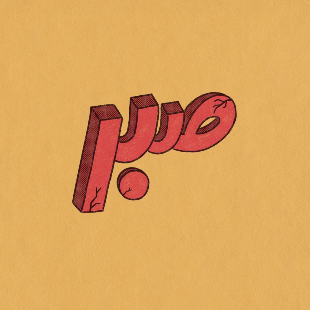
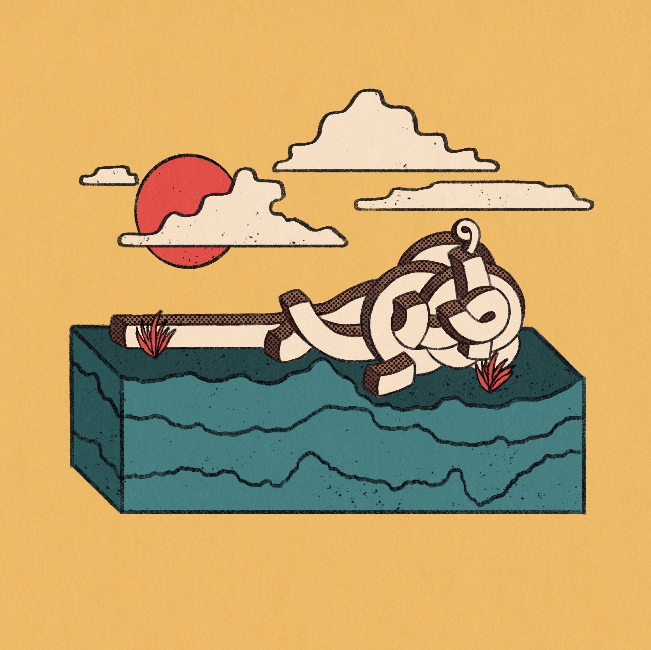
Having gained an understanding of functional fonts in Persian, Aienehdar went on to use ‘creative lettering’ as a means of expression using the Persian script.
“Unlike fonts, which have a practical purpose, creative lettering is more emotive and decorative, than functional,” Aienehdar explains. “My personal approach was to use colors, textures, angles, depth, and even 3D to create words in Persian that my Arabic-speaking classmates were not familiar with, but due to the illustrative nature of the presentation, they could understand.”
Aienehdar says that when she eventually completed Prof. Hamdy’s classes, she did so with a re-kindled a sense of pride in her own language, and, her identity.
“Prof. Hamdy’s approach was quite different to what I’d anticipated,” she recalls. “I had expected discussions that were fixed and rather rigid, with hardly any room for creativity. On the contrary, when I told her that on the back of our discussions on Arabic typography, I’d like to research Persian typography, and subsequently, creative lettering, she couldn’t have been more supportive. As a third culture kid here in Doha, it was incredible to be able to research, create and share a part of my heritage with my classmates and teachers.
“It made me realize how important my culture was to my identity. It’s the kind of teaching that is inspiring. It’s empowering. And that’s what education is all about.”
Words by Mary Joseph
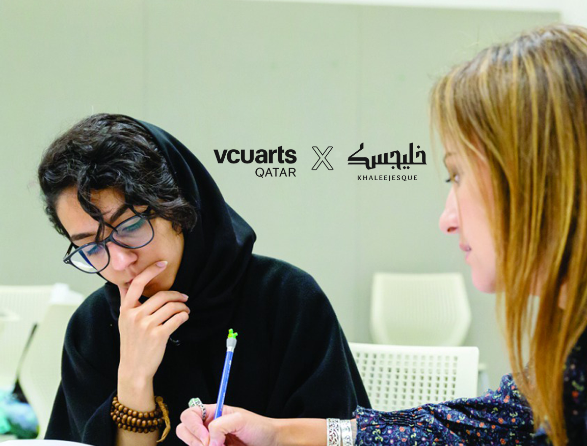
This series is part of an editorial partnership brought to you by VCUarts Qatar and Khaleejesque