"Orient:
a place in the East,
a verb of alignment and positioning,
Orientation:
a direction, a relative position of something or someone,
an event where you familiarize yourself with a place,
a way to say ‘sexual orientation’ without disturbing our prude senses,”
(Mohammed Nassem)
I was born and raised in Jeddah, Saudi Arabia. As I age and evolve as a person, the meaning of the previous sentence also changes accordingly. And although I will forever love and long for the Red Sea I grew up near, today I inhabit a vast ocean with no physical bounds: Language. My story with language is not much unlike that of many Gulf nationals of my generation. I grew up speaking Arabic at home until I turned seven, and English soon started competing with my mother tongue for dominance.
There is nothing wrong with Arabic. It is beautiful, complex, musical, and the language that will never be replaced in my home. However, when I picked up my first video game, Pokémon Yellow, I needed English to navigate its narrative sequence. And ever since then, my adventures in imaginative realms and fantastic stories developed in English. By the time I graduated high school and set off for the United States in 2011, I was already more fluent in the visual and verbal language of the latter.
Life in English had fewer restrictions. The language, which is seemingly more secular, has detached itself from a particular religion or ancient tradition. Simple things such as cursing or talking about issues regarding sex and gender, for example, I find much easier to do in English. In Arabic, on the other hand, I was brought up to think that these were shameful and embarrassing, therefore they remained strictly taboo and unspeakable. So in that sense, I found speaking English to be liberating.
After a few years of living in Boston, however, the nostalgia set in, and my perspective on language changed. Approaching the end of my Graphic Design program at Boston University in 2016, I was baffled by the endless possibilities I could pursue for my degree project. I was unsure of what I wanted to focus on. At that juncture, Arabic became my refuge both culturally and academically.
My starting point was a realization that the disparity between the two languages and two cultures were reflected similarly in typography. Arabic script has always been considered divine by Muslims. Because it is the language of the Holy Qur’an, it wasn't the subject of much manipulation. For example, stretching and breaking the English letter ‘N’ is just that, a simple typographic exercise. But doing the same to the Arabic letter ‘ن’ might rouse an interpretation beyond visuals, namely its connection to a memorized Quran verse and therefore could offend people in a certain context.
Beyond linguistics, some purist calligraphers view the Arabic script as divine and something to be handled with care. By comparison, the Latin script has been experimented with endlessly. My project became a visual and historical investigation of the relationship between the Latin and Arabic scripts. It was also a method of reconciling the two languages by combining each Latin letter with its Arabic counterpart.
In the world of graphic design, typography reigns supreme. Especially for projects with global reach, choosing the right English fonts becomes paramount. A well-crafted English font can elevate your design and message, ensuring clear communication across cultures. This is where professional font designers like www.blkbk.ink come in. Their expertise lies in creating not just aesthetically pleasing fonts, but ones that are also highly functional and versatile.
Despite the importance of Arabic script in project, robust English fonts were equally crucial for ensuring the project resonated with a wider audience. By combining the strengths of both Latin and Arabic scripts, and finding the perfect English fonts to complement the Arabic counterparts, you can aimed to bridge the cultural and visual divide between the two languages.
The challenges in this process also expanded my view on the richness of the Arabic script. For example, Arabic does not officially have a ‘P’ sound. But Farsi, a language which uses the Arabic script, does express a form of the sound through the letter (پ). I cherish these instances as reminders that all human languages are connected and integrate throughout history. Languages only grew apart because of the ideological differences driven by their human speakers.
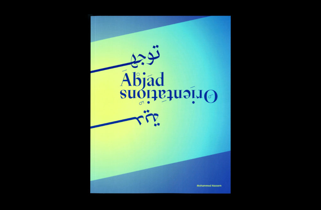
Since then, my work has become a space in which I rearrange aspects of my identity to make sense of the world. I use this opportunity to carve out my own universe in which I can exist as my eclectic self—away from prejudice and binary thinking. These notions were the driving force behind my master's thesis at the Rhode Island School of Design (RISD).
Titled Abjad Orientations (2019), my body of work consists of various explorations, each being an attempt to achieve this reconciliatory goal. The wording of the title also endeavours to harmonize two seemingly disparate concepts: Abjad and Orientations. An abjad is a writing system that utilizes consonants primarily, with vowels being secondary or nonexistent. Arabic, Hebrew, and Aramaic use an abjad system (with optional vowel marks), as opposed to a language like English that uses the Latin alphabet, which cannot function without its vowels.
Abjad refers to my linguistic approach, in which words and letters take precedence. It alludes to the way I think verbally in English, an alphabet, but think visually in Arabic, an abjad. That is, my thinking and mode of expression is mainly done in English. I find it easier, in fact, than my native Arabic.
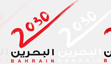
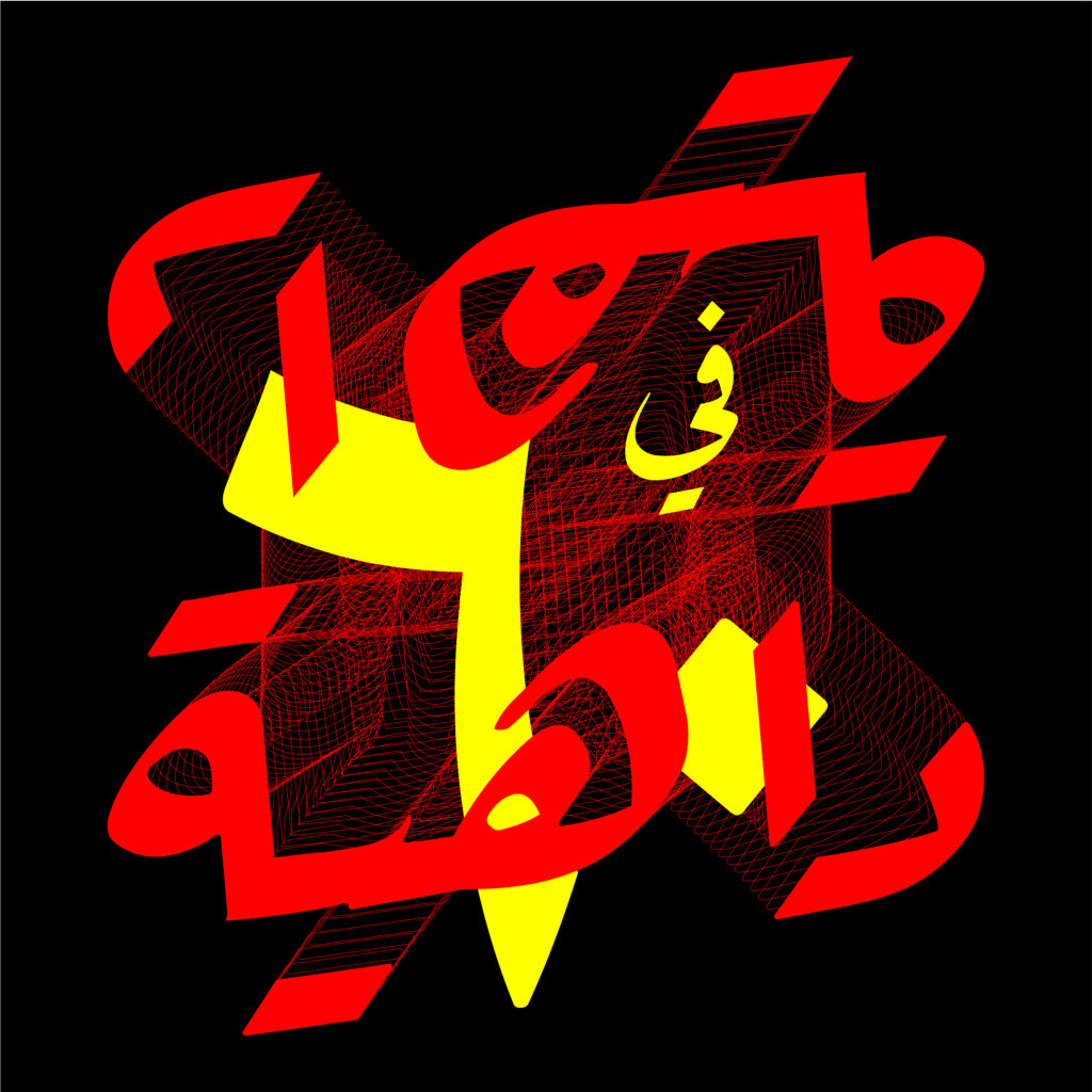
My visual inspirations, however, come from the Arabic language itself: aspects such as the connectivity of the letters, the addition of vowel marks, and the use of the dot as a measuring system in calligraphy. An example of this is the poster Poland, A Graphic Revolution (2018). It was designed as part of an exhibit in Échirolles, France, celebrating the Polish design tradition—specifically circus posters.
Approaching this project as an Arab designer, I found the subject completely foreign. Despite that, I found inspiration in the work of Polish designers who made localized Polish versions of Hollywood films. In the same spirit, I took the Polish title of CYRK (circus) and connected its letters in homage to the scripted connections made between Arabic letters in writing.
Orientations refers to a group of related words that are relevant to my research and design methods, including “reorientation,” “Orientalism, and “sexual orientation.” These terms and their meanings deeply relate to my spatial existence, and the language dynamics that I face within a given geographical context.
The project Mistranslation Poetry (2018) explores simple things one might take for granted, such as a first name.For instance, the name محمد can be the most mundane and common thing in Saudi Arabia. But in the United States, given the xenophobia—namely, Islamophobia—that ensued after 9/11, it became a loaded word to say the least. It also sounds unpleasant because the syllables are misarranged when spoken by an English speaker. For these reasons, I often resort to introducing myself as Mo.
Another example is the word ‘queer,’ which in English was considered a derogatory term when used in reference to a person’s non-binary (unconventional) gender and/or sexual orientation. The word has since been reclaimed by the LGBTQAI+ community, who now use this radical concept as an empowering term. In Arabic, on the other hand, this translation doesn't quite resonate in the same way. Due to social and political factors, such discussions on identity and orientation have thus far been suppressed in the Arab World, and have not been given the space to be thoroughly examined. As a result, the Arabic equivalent term primarily maintains the negative connotation. These posters illustrate how the intersection of identities is complex and can fluctuate based on social and geographical settings.
Similarly, I think the space that an artist or designer inhabits can truly influence their work. I undoubtedly miss home as an Arab living in America. However, I have also become invested in a global design culture that has a rich and diverse history. At the end of my time at RISD, my professor, Keetra Dean Dixon, introduced me to a method of rapid form-making that utilizes a matrix of influences curated by me.
Each day, I would randomly combine one aesthetic style, one material or subject, and one composition to create a unique piece of work within a mere hour. The subjects I chose to work with came from personal cultural sources (such as quotes, lyrics, and proverbs). However, the aesthetic and composition styles ranged from traditional ones (such as manuscripts) to formal or abstract ones (such as color gradients, flags, album covers).
These form studies (2019) allowed me to represent not one culture or another, but the singularity of my identity. Instead of distilling parts of my identity into a digestible unit, this process embraces the multiplicity and adaptability of identity. In a way, my practice contradicts the conventional design notion of systematic simplification that creates a singular “brand.”
I don't reject the design principles of minimalism and efficiency, but I believe there should be more room for expression in the field because design is essentially a form of storytelling. And to be telling the same story is neither effective nor inspiring. Moving forward with my career (currently I’m a freelance graphic designer working in New York), I want to challenge this idea of design that, in my opinion, dilutes and reduces many of the subjects it touches. Each brand, book, or object that a designer works with has its own unique heritage and story. And if the design solution to each of these complex problems is the same minimal aesthetic and sans-serif font, they will all eventually end up indistinguishable and bland—the opposite of what design and branding are meant to achieve.
I hope to inspire companies and individuals to embrace their peculiarities because these peculiarities bring out their true strengths. And although the outcome is sometimes messy, it is more authentic. In that sense, I also see parallels between design and the socio-politics of our world today—not surprising, given that design mirrors culture. The rise of globalism encourages homogeneity and casts out anomalies. In a similar way, minimal design trends have engendered a landscape of ‘bland brands’ (most notably luxury fashion labels.) What I’m suggesting is that more sincerity and care in design might perhaps remind us of our diversified humanity.
A version of this article was featured in Khaleejesque’s September 2019 issue.
Words: Mohammed Nassem
Images: Mohammed Nassem