Remember back in the 90s when you first watched Disney's cartoon version of Alice in Wonderland and was fascinated as Alice tumbled gracefully down a tunnel with upside down furniture floating around her?
I'm sure, like myself, you were thinking “I want that too!” Well leave it to the avant-garde fashion duo Viktor Horsting and Rolf Snoeren, better known in the fashion world as Viktor & Rolf, to create a store interior to match their daring and over the top fashion line – and one that reminds us of that special scene in Alice in Wonderland.
Located in the heart of Milan, the Viktor & Rolf "Upside Down Store" was opened in April 2005. Unfortunately, the store only lasted a little more than three years and closed down in August 2008. Nevertheless, fortunately for us design afficionados it left a great imprint in the design world.
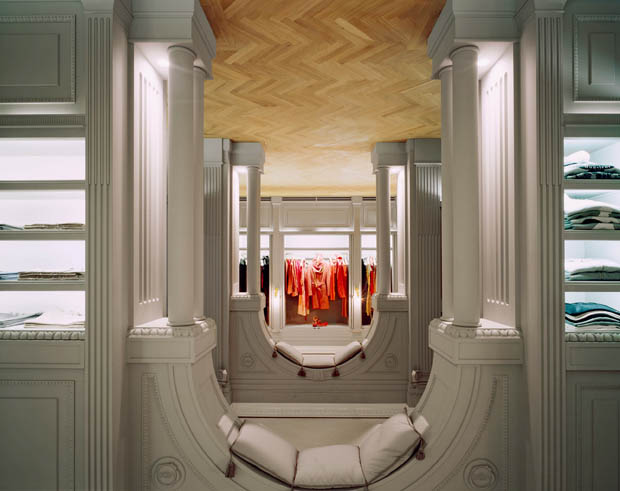
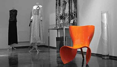
 The interior design and architecture of the space is such an optically wondrous place. Designed by Siebe Tettero and Sherrie Zwail of SZI DesignSiebe, the store has a 19th century French boudoir interior with a modern twist; literally. The whole store looks like it was flipped upside down!
The store was initially assembled offsite until all the technical design and perspective work was done and then disassembled and reassembled onsite again in the Via Sant’Andrea location. Think of it as a life-size Lego game; first the designers create sketches and drawings of the place; then they go through the technical joinery details before assembling the interior to avoid mistakes and mishaps. The store is divided into a central axis from the entrance as well as a cross axis; there are two clothing areas, a perfume area, fitting rooms and a tailoring/altering room.
 The store ceiling is clad with gorgeous soft brown herringbone oak parquet (which is usually used as a flooring material), marble mantelpieces, as well as custom made gold leaf “floor element” chandeliers to light up the flooring space. The ceiling also includes Parisian chairs, tables and shelving units, which are innovatively used as hanging systems for the clothing items and perfumes.
Archways throughout the whole store are utilized as cushioned sitting areas as well as spatial dividers. The detailed intricate ceiling cornice is considered as flooring skirting and vise versa for the ceiling.
As for the paneling and wall elements, the store is decorated with square panels and flute columns and further decorated with mirrors to make the space seem even more spacious which is a vital design element because of the characteristic of the store and how it is meant to look illusive.
When it comes to the colors, the Viktor & Rolf store maintained a monochrome neutral color palette of dusted white, light grey, mint green, and a few dabs of gold leaf paint on archways to give some vibrancy to the rather calm set of palette.
The choice of such a tranquil color palette was brilliantly chosen to unify the store feeling and balance out the strong 'upside down' architecture theme. This way the calm colors balance out the bold shapes of the store and allows the rainbow shades of color to be provided only through the fashion pieces on sale.
Truth be told, the store's interior would have not worked for any other fashion house because such bold and avant-garde elements reflect the designers themselves.
The Dutch born fashion designers moved to Paris to launch their career back in 1993 with a first collection that was based on distortion and reconstruction. To this day, they still stay true to their design vision as they turn out the most absurd and also amazing creations year after year.
It's too bad we can't live the true experience of the store anymore. We can only dream!
– Ali Al Najjar
Images courtesy of Tettero


