How do you rebrand a magazine? With no right or wrong answer, our team embarked on a 10-month self-reflective journey that saw us study our peers, observe the international contemporary design landscape, and learn a thing or two about decision making. It really was a team effort, everyone had an opinion, we all had experience but we knew that to up our game we had to become experts. From minute design details to the editorial philosophy, every aspect of our establishment was dissected and rebuilt with a fresh approach.
A major part of our redesign was replacing our beautiful logo, designed previously by the renowned Bahraini agency Obai & Hill. Mohammad Sharaf came highly recommended to us and it wasn’t long before we’d filled him in on the progress we’d made in redesigning the layouts for print and Sharaf had initiated the first steps to creating our new logo.
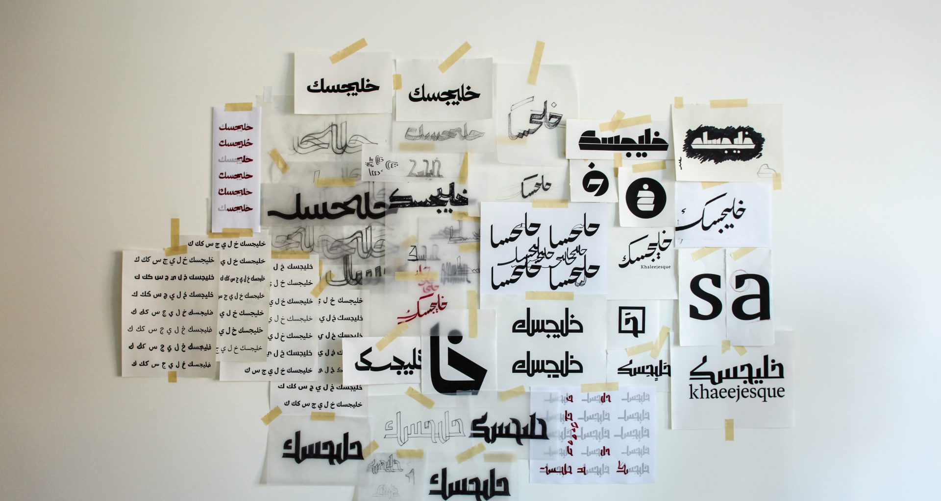
When Sharaf received the brief, the first thing he did was break down the word into a basic skeleton. Studying each letter in Arabic, he explained, “I observed at how they interact with each other in their shape, stroke, height, contrast, flow, and their connection”. Sharaf looked into the negative and positive space in detail.

He began his creative process by stripping down the word into a mono-thin-line form and researching the typography of old publications, how their title pages were designed and juxtapositioning these with other calligraphic and typographic resources. As an exercise, he printed Khaleejesque using existing fonts to see how the word would form, which was a base interpretation of reforming the style.
As the logo for a regionally renowned publication, Sharaf felt a heightened awareness that the logo should be contemporary but timeless, stand out but not overwhelm and transcend cultural boundaries to be accepted whether it be placed in a creative setting or academic.
The name is a fusion of the Arabic word “Khaleej” and the French suffix “Esque”, meaning the name stems from the essence of the Arabian Gulf. Bing a coined word, a key factor that the Khaleejesque Team took into consideration was the readability of the wordmark.
Sharaf took into consideration the vision and mission of the publication as being to showcase and support regional personalities, brands, and initiatives; recognizing that a key element is continuing cultural heritage. From this point, he told us “I took inspiration from the Fatimi Kufic font”, one of the oldest yet most contemporary looking Arabic calligraphies.
The contrast of the thickness and hard diagonal cuts gives the logo a distinct edgy look while maintaining organic flow in the connections between the letters.
Back at the office, we waited eagerly for each new round of the logo designs. We scrutinized, ripped apart, criticized, and then politely replied with constructive criticism. Each step felt like an uphill journey; it can be tough working on a new image, one that you’ll be sending out to a design conscious audience who naturally we desire to impress. Yet with every step, we drew closer to what you see today, a refined representation of a contemporary lifestyle magazine with a strong sense of its roots in culture.

