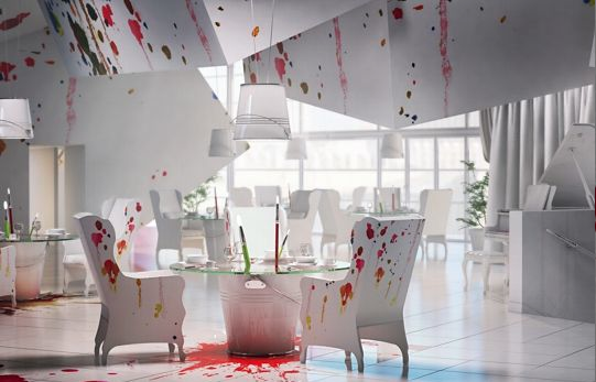
The interior of any office, restaurant, or home is the first thing that catches the sight of visitors. It changes the environment, the mood, and could even make or break your day. How about this for interior? An architecture and design firm in Poland have designed the most wacky and vibrant interior in any restaurant you may ever visit. 'Wamhouse' is their name and their one-of-a-kind restaurant is 'Pracownia' which means 'workshop' in Polish which literally applies to this restaurant.
When it comes to designing commercial spaces like offices or restaurants, one key consideration is the use of commercial office fitouts. These fitouts play a vital role in optimizing the use of space, enhancing employee comfort, and maintaining a cohesive aesthetic that aligns with the brand’s identity. A well-executed office fitout can increase employee satisfaction and improve overall work dynamics, much like the vibrant yet functional design of 'Pracownia' transforms dining into an immersive experience. The balance between practicality and creativity is essential in designing spaces that not only serve their purpose but also inspire those who interact with them.
When designing commercial spaces, the selection of doors is just as crucial as any other aspect of the fitout. Doors not only contribute to the overall aesthetic but also ensure functionality, security, and accessibility. Whether it’s the welcoming entrance of a restaurant or the private offices of a corporate space, the choice of door plays a pivotal role in setting the tone of the environment. For instance, sleek, modern doors in an office can convey professionalism, while more rustic or industrial doors might be suited to creative or casual spaces, enhancing the visual appeal without compromising practicality.
In addition to their aesthetic contribution, commercial doors are integral to the safety and efficiency of a commercial environment. They need to meet specific regulations and standards, ensuring they function well under high-traffic conditions. The right doors not only complete the look of a space but also provide the necessary security, privacy, and noise control required in bustling office or restaurant settings. Choosing durable, well-designed doors can elevate the entire experience of a commercial fitout, reinforcing the space’s purpose and adding to its long-term functionality.
Designed by Karina Wiciak of Wamhouse, Pracownia is expected to attract more visitors by the day. Their design? Splashed and splattered paint across the entire restaurant. Oversized paintbrushes and chaotic paint designs take up the entire room which is sure to please art lovers who visit. When the interior is this cool, who cares about the food but would would it be a distraction or delight for you guys? Tell us below!


– Adnan Al-Timimi
Images: http://www.wamhouse.pl/en

